
Visualizing the data as part of the research output is essential. It would help the reader enjoy the reading process and understand what is behind the data or findings.
In this post, I want to share how to embed the chart into a blog. I use Google Golab to run Python code and process the data, and I use https://chart-studio.plotly.com/ to register my API Key. We should ensure two things. First, we register the API key, which should be included in the Python code.
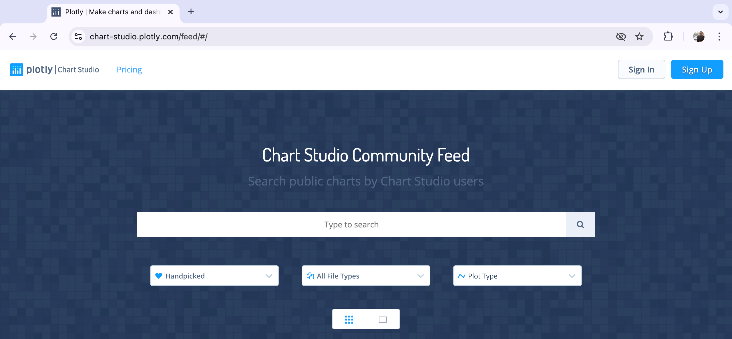
1. Register API. Go to https://chart-studio.plotly.com/feed/#/ to sign in. If you do not have the account, sign up first.
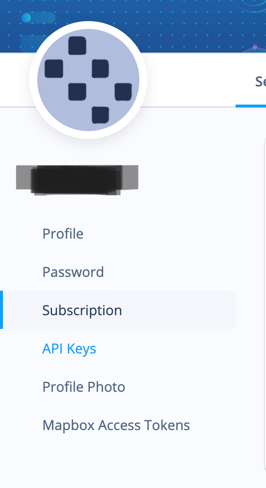
2. After login, go to the right side on the above page, click Settings

3. After clicking the settings, go to the interface on the left side of the page. Click API Keys to enter the page of API Settings
4. The API Settings page contains two information: username and API Key. We need the username and API key embedded in our Python code. Click Generate/Regenerate Key to create your API Key.
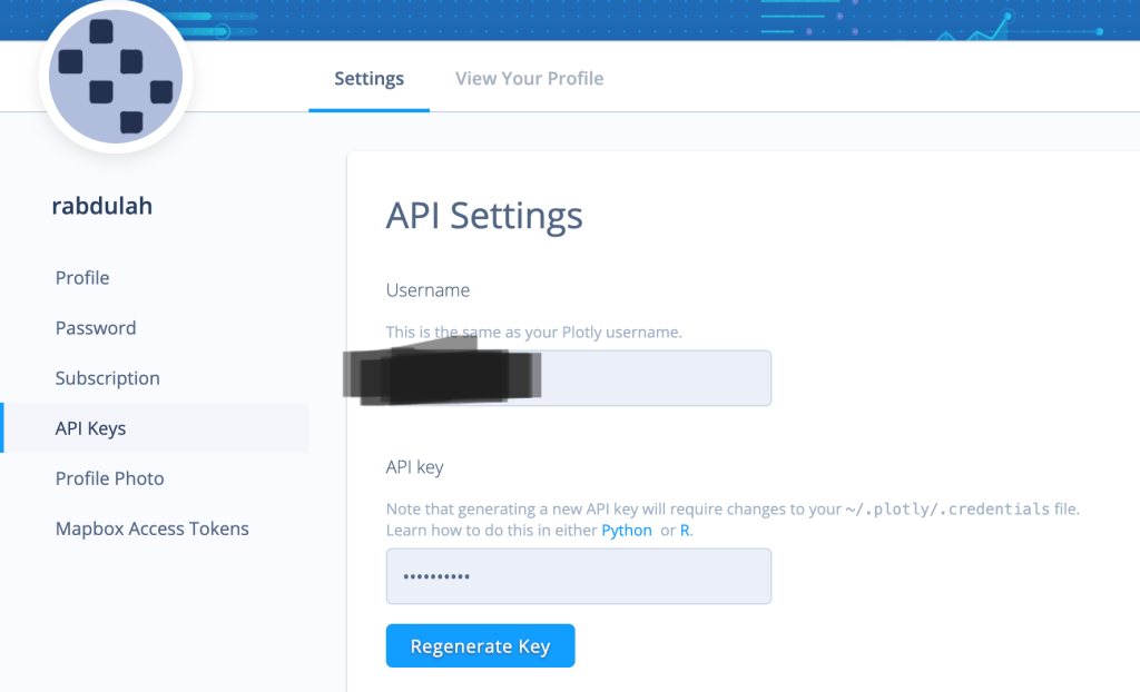
5. Your API Key is successfully generated

6. Put your API Username and Key into your Python chart command
import chart_studio
import chart_studio.plotly as py

# Set your Chart Studio credentials
chart_studio.tools.set_credentials_file(username='your_username', api_key='your_api_key')

# Your existing code to create the figure/plot/chart
# ...

# Upload the figure to Chart Studio
py.plot(fig, filename='your_filename', auto_open=False)
7. After running the code, your_username and your_plot_id will appear under the chart. Copy your_username and your_plot_id into WordPress.
8. Go to your WordPress page. You can embed your plot chart or graph into your blog page using the Plotly WordPress Plugin or an Iframe. In this tutorial, I will use an Iframe.
9. In your WordPress post, switch to the HTML editor and paste the your_username and your_plot_id with your Chart Studio username and the ID of your uploaded plot. Here is the appearance of the HTML editor code in WordPress:
<iframe width="900" height="800" frameborder="0" scrolling="no" src="https://plotly.com/~your_username/your_plot_id.embed"></iframe>The Local Indicators of Spatial Association (LISA) of Poverty in Central Java, Indonesia 2022.
Below is an example of my plot chart using Plotly Chart Studio. This chart shows the LISA scatter of poverty in Central Java Province, Indonesia, in 2022. Four quadrants represent the High-High, High-Low, Low-High, and Low-Low clusters of poverty. Using the weight queen matrix, four regions are included in the high-high cluster of poverty in Central Java in 2022: Kebumen, Banyumas, Wonosobo, and Purworejo.

Leave a comment